Ornamented Types
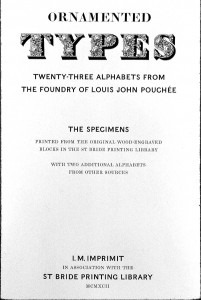
Twenty-three alphabets from the foundry of Louis John Pouchée
With an Introduction by James Mosley
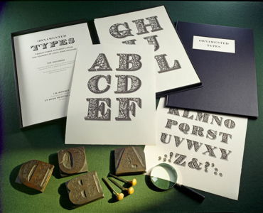
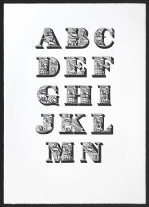
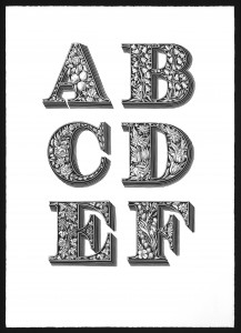
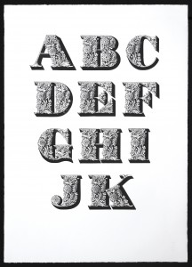
The first complete printing and publication of an unique collection of 23 alphabets of wood-engraved ornamented letters in the collection of the St Bride Printing Library, London; with two additional alphabets. The letters were engraved by hand in the 1820s as patterns from which metal stereotypes could be made for sale to poster-printers. They are here printed from the original wood-blocks on the hand presses at I. M. Imprimit. The illustrated Prospectus contains a brief account of the alphabets and their rediscovery in the twentieth century, this their first printing, and full details of the publication.
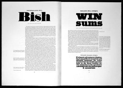
The edition is in two parts, presented as a matching set. The box of the Specimens is accompanied by a letterpress-printed folio volume of Introduction fully illustrated with comparative material from typefounders’ specimen books and other sources, many reproduced here for the first time.
The Specimens
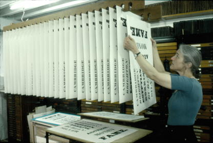
The twenty-five alphabets vary in size from 6-line pica (1 inch) to 26-line pica (c. 4¼ inches). The presentation on unbound folio sheets allows each alphabet to be viewed in its entirety – the larger sizes requiring from two to five sheets. Sheet size: 530mm x 380mm. The total of 46 sheeets are presented in a black buckram-covered Solander box, with a printed label in an embossed panel.
The Introduction
The Introduction is written by James Mosley, Librarian of the St Bride Printing Library and the custodian of Pouchée’s wood-engraved alphabets. Mosley is the acknowleged world expert on the history of printing and type design. The text tells the full story of Pouchée’s activities as a type founder and the history of ornamentation in type design as developments in type-casting and the newly-developed iron presses enabled increasingly bigger posters to be printed. The text is illustrated by many previously un-reproduced type specimens, printed actual size. The Introduction is presented as a large folio volume of 48 pages of the same size as the Specimen sheets, bound in black library buckram with a printed label in an embossed panel matching that of the Specimens, and contained in a slipcase.
Typography: Designed by Ian Mortimer.The text is hand set in `Scotch Roman’ (Monotype Series 137) with founders’ display types including Fry’s `Canon’ and William Caslon IV’s `Egyptian’ of 1816, which was specially recast for this edition at the Oxford University Press.
Paper: Zerkall mould-made 170gsm., specially made for this edition.
Edition: 200 numbered sets + 10 sets hors commerce
The publication was awarded the Premio Felice Feliciano in Verona, 1995. The citation stated: `A monumental work whose proportions are suited to the ornamental types reproduced. The print is superb, especially the black matt ink that produces an outstanding effect. The choice of the types employed in the text and the titles is excellent . . . . Each page, studied in every detail, is a masterpiece.’
© I. M. Imprimit and the Corporation of the City of London, 1990-1994
Images and design © 1960-2026 Ian Mortimer.

